Loading
Templates
🏔️
Geotechnical Engineering
Loading
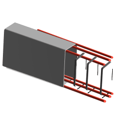
Foundation Bearing Failure Modes and Capacities
Loading
Bearing Capacity Calculator - Meyerhof Approach
Code source
No sub pages
Loading
Bearing Capacity Calculator - Terzaghi
Bearing capacity
No sub pages
Loading

Weight to Volume relationships in soils
Soil Sample
No sub pages
⭕
Mohr's Circle for 2D Stresses
2D Mohr's
No sub pages
⚪
3D Mohr's Circle
3D Mohrs
No sub pages
Loading

Products & Materials
Loading
Wood - Densities of Various Species and Mass Calculator
Wood - Densities of Various Species
No sub pages
Loading

Maths Calculations
Loading

Square, Cube, Square Root and Cubic Root Calculator
No sub pages
📐
Pythagorean Theorem Calculator
📏
Determine the Length Of a Side
No sub pages
📐
Triangle Angle Calculator
No sub pages
📐
Equilateral Triangle Calculator
No sub pages
📐
Right Triangle Calculator
No sub pages
📜
Heron's Formula Calculator
No sub pages
📐
Calculate Arc Length and Sector Area
No sub pages
📏
Circle Dimension Calculator
No sub pages
🟨
Cube Surface Area & Volume Calculator
No sub pages
⚽
Dodecahedron: Surface Area & Volume
No sub pages
💈
Volume & Surface Area of Cylinder Calculator
No sub pages
🔵
Calculate Sphere Surface Area And Volume
No sub pages
Loading
Hexadecimal to Binary Converter
Binary Spreadsheet
No sub pages
Loading
Prime Number Checker
Prime Number Spreadsheet
No sub pages
Loading
Poisson Distribution Calculator
No sub pages
Loading
Harmonic Mean Calculator
Code source
No sub pages
📐
Tangential Angle Method for setting out circular curves
Code source (1)
No sub pages
Loading
Harmonic Number Calculator
Code source
No sub pages
📈
Slope and Gradient Calculator
No sub pages
Loading
Polar-Cartesian Coordinate Converter
Code source (5)
No sub pages
Code source (4)
No sub pages
Code source (3)
No sub pages
Code source (2)
No sub pages
Code source (1)
No sub pages
Code source
No sub pages
📈
Function Plotter
Code source
No sub pages
📐
Euler Line Calculator
Euler Line
No sub pages
Loading
Convolution Calculator
Loading
Physics Calculations
Relativity and Quantum Mechanics
🚀
Energy Mass Equivalency
No sub pages
Statics
Loading

Slenderness Ratio Calculator
No sub pages
Loading
Moment of Inertia Calculators
Loading
Moment of Inertia Calculator: Solid Rectangular Section
No sub pages
Loading
Moment of Inertia Calculator: Rectangular Hollow Section (SHS/RHS)
No sub pages
Loading
Moment of Inertia Calculator: Solid Circular Section
No sub pages
Loading
Moment of Inertia Calculator: Circular Hollow Section
No sub pages
Loading
Moment of Inertia Calculator: I Beam
No sub pages
Loading
Moment of Inertia Calculator: T Section
No sub pages
Loading
Moment of Inertia Calculator: Angle Section
No sub pages
Loading
Moment of Inertia Calculator: Channel Section
No sub pages
Loading
Moment of Inertia Calculator: Triangular Section
No sub pages
Loading
Moment of Inertia Calculator: Trapezoidal Area Section
No sub pages
📖
Hooke's Law
No sub pages
Loading
Radius of Gyration in Structural Engineering
aisc-shapes-database-v160-all_sects
No sub pages
Loading
Centre of Mass Calculator
No sub pages
Loading
Centre of Gravity Calculator
No sub pages
Loading
Stress Calculator
No sub pages
Loading
Strain Calculator
No sub pages
Loading
Elastic Section Modulus Calculator
aisc-shapes-database-v160-all_sects
No sub pages
Loading
C-Channel Shape Elastic Section Modulus Calculator
No sub pages
Loading
Diamond Shape Elastic Section Modulus Calculator
No sub pages
Loading
Hollow Rectangle Square Elastic Section Modulus Calculator
No sub pages
Loading
Hollow Round Elastic Section Modulus Calculator
No sub pages
Loading
Circle Round Elastic Section Modulus Calculator
No sub pages
Loading
I Beam Elastic Section Modulus Calculator
No sub pages
Loading
Rectangle Elastic Section Modulus Calculator
No sub pages
Loading
Mass Moment of Inertia
Loading
Solid Cylinder - Central Axis
No sub pages
Loading
Solid Cylinder - Diameter
No sub pages
Loading
Cuboid
No sub pages
Loading
Hoop - Central Axis
No sub pages
Loading
Hoop - Diameter
No sub pages
Loading
Solid Sphere
No sub pages
Loading
Hollow Sphere
No sub pages
Loading
Rod - Centre Normal Axis
No sub pages
Loading
Rod - End face Axis
No sub pages
Loading
Regular Tetrahedron
No sub pages
Loading
Regular Octahedron
No sub pages
Loading
Right Solid Circular Cone
No sub pages
Loading
Right Hollow Circular Cone
No sub pages
Loading
Torus
No sub pages
Loading
Torsion of Shafts
Loading
I-Section Shaft Torsion
No sub pages
Loading
C-Channel Section Shaft
No sub pages
Loading
Hexagon Shaft Torsion
No sub pages
Loading
Square Shaft Torsion
No sub pages
Loading
Rectangle Shaft Torsion
No sub pages
Loading
Ellipse Shaft Torsion
No sub pages
Loading
Hollow Cylinder Shaft Torsion
No sub pages
Loading
Solid Cylinder Shaft Torsion
No sub pages
Loading
Rectangle Hollow Shaft Torsion
No sub pages
Loading
Triangle Shaft Maximum Allowable Torsion
No sub pages
Loading
Shear Modulus Calculator
No sub pages
Loading
Relationship between Young's modulus, bulk modulus and Poisson’s ratio
No sub pages
🌉
Steel Wire Tension Calculator
Code source
No sub pages
Loading
Poisson Ratio Calculator
Poisson's Ratio
No sub pages
Dynamics
⚡
Potential Energy Calculator
No sub pages
🍂
Freefall Height Calculator
No sub pages
🍂
Freefall Velocity Calculator
No sub pages
🏎️
Acceleration vs. Velocity equations
No sub pages
⭕
Rotational Kinetic Energy Calculator
No sub pages
🎡
Angular Velocity Calculator
No sub pages
👟
Work Calculator
No sub pages
🚃
Impulse and Momentum Calculator
No sub pages
Loading
Force Due To Acceleration
No sub pages
🚄
Kinetic Energy Calculator
No sub pages
🕰️
Pendulum Calculator
No sub pages
〰️
Simple Harmonic Motion Calculator
Code source
No sub pages
〰️
Frequency of a Simple Harmonic Motion Calculator
Code source
No sub pages
〰️
Time Period of a Simple Harmonic Motion Calculator
Code source
No sub pages
〰️
Damped Harmonic Motion Energy Loss Calculator
Code source
No sub pages
⭕
Centripetal Force Calculator
Centripetal Force-Acceleration Calculator
No sub pages
〰️
Velocity of a Simple Harmonic Motion Calculator
Code source
No sub pages
🎸
Longitudinal Vibration of Rods Calculator
Code source
No sub pages
Loading
Dunkerley’s Method for Beam Vibration Calculator
Code source
No sub pages
〰️
Acceleration of a Simple Harmonic Motion Calculator (related to the displacement)
Code source
No sub pages
🎡
Angular Acceleration Calculator
No sub pages
〰️
Acceleration of a Simple Harmonic Motion Calculator
Code source
No sub pages
🎡
Average Angular Acceleration Calculator
No sub pages
🔊
Total Harmonic Distortion (THD) Calculator
Code source
No sub pages
〰️
Displacement of Harmonic Motion Calculator
Code source
No sub pages
Astrophysics
🛰️
Orbital Mechanics Calculator
Orbital Mechanics
No sub pages
🪐
Kepler's First Law Calculator
Code source
No sub pages
🪐
Kepler's Third Law Calculator
Code source
No sub pages
🪐
Y-coordinate of Keplerian Orbit
Code source
No sub pages
🪐
Gravitational Force Calculator
No sub pages
Acoustics and Optics
Thermodynamics and Fluid Dynamics
🔥
Specific Heats of Solids and Heat Transfer Calculator
Solids - Specific Heats
No sub pages
💨
Pressure Calculator
No sub pages
Loading

Bernoulli Calculator
Loading
Bernoulli Equation Calculator: Volume Flow Rate
No sub pages
Loading
Bernoulli Mass Flow Rate Calculator
No sub pages
🎈
Hot Air Balloons - Calculating Lifting Force
No sub pages
📖
Froude Number Calculator: Open Channel Flow
No sub pages
🌬️
Air Density and Specific Weight Calculator
Density and Specific Weight
No sub pages
💨
Total and Partial Pressure Calculator
No sub pages
🧲
Magnetic Prandtl Number Calculator
No sub pages
🌊
Reynolds Number Calculator
Code source (3)
No sub pages
Code source (2)
No sub pages
Code source (1)
No sub pages
Code source
No sub pages
🧲
Magnetic Reynolds Number Calculator for eddy current braking
No sub pages
🧲
Magnetic Reynolds Number Calculator
No sub pages
🌊
Knudsen Number Calculator
No sub pages
🌊
Reynolds Number Calculator (for motion of a viscous fluid)
No sub pages
🌊
Péclet Number Calculator
Loading
Péclet number (for heat transfer using Reynolds number)
No sub pages
Loading
Péclet number (for mass transfer using Reynolds number)
No sub pages
🌊
Richardson Number Calculator
No sub pages
🌊
Bejan Number Calculator
No sub pages
✈️
Drag Force and Drag Coefficient Calculator
No sub pages
🌊
Density, Specific Weight and Specific Gravity Calculator
🛩️
Mach Wave Angle Calculator
Code source
No sub pages
Loading
Diffusion Rate Calculator
No sub pages
Loading

Electrical Engineering
Loading

DC Power Circuit Calculator
No sub pages
Loading
Ohm's Law To Calculate Voltage In a Circuit
No sub pages
Loading
Inductive Reactance Calculator
No sub pages
Loading
Capacitive Reactance Calculator
No sub pages
Loading
Full Load Current Calculator
No sub pages
Loading
Generator Fault Current Calculator
No sub pages
Loading
Generator Load Current Calculator
No sub pages
Loading
Transformer Full Load Current and Turns Ratio Calculator
No sub pages
Loading
Transformer Short Circuit Calculation
No sub pages
Loading
Short Circuit Current Calculation For Cable AS/NZS 3008
No sub pages
Loading
Battery Capacity Calculator
No sub pages
Loading

3-Phase Power Calculator
No sub pages
Loading
Wire Voltage Drop Calculator to AS/NZS 3008
No sub pages
Loading
AC Induction Motor Speed Calculator
No sub pages
Loading
AC Current Calculator (3Ph, 1Ph)
No sub pages
Loading
Electric Motor Torque Calculator
No sub pages
🧾
Electricity Bill Calculator
No sub pages
🔥
Arc Flash Calculator
No sub pages
Loading
RLC Circuit Calculator
Code source
No sub pages
Loading
Maximum Demand Calculator to AS/NZS 3000
MAXIMUM DEMAND CALC - AS3000
No sub pages
Loading
Energy Optimisation Calculator
Code source
No sub pages
Loading
Construction Calculations
🚚
Truck Bed Volume and Weight Calculator
Code source
No sub pages
Loading
Calculate Cement, Sand & Aggregate Quantity in Concrete
🌊
Water Tank Capacity Calculator
No sub pages
Loading
Rebar Weight Calculator
No sub pages
Loading
Civil Engineering
🔥
Bushfire Attack Level Calculator to AS 3959-2018
Bushfire Attack Level Calculator to AS 3959-2018
No sub pages
🚔
Road Base Calculator
No sub pages
Loading

Structural Engineering
Loading
Beam Analysis Calculators
Loading
Single-Span Beam Analysis
Single-Span Beam Analysis
No sub pages
Loading
Multi-Span Beam Analysis Tool
Code source
No sub pages
💈
Column Buckling Calculator
🇦🇺
AS/NZ
Loading
Concrete Beam Designer to AS3600
CT - RC Beam Design to AS3600
No sub pages
🔩
Bolt Group Calculator to AS 4100
Bolt Group - AS4100 - Fixed
No sub pages
Loading
Fillet Weld Group Calculator to AS4100
Weld Group - AS4100 (Example)
No sub pages
Loading
Steel Beam and Column Designer to AS4100
CT - Standard Steel Section Capacity
No sub pages
Loading
Timber Beam Calculator to AS1720.1
CT - Timber Member Design to AS17201
No sub pages
Loading
Timber Column Calculator to AS1720.1
CT - Timber Column Design to AS17201
No sub pages
Loading
Concrete Slab-on-grade Designer to AS3600
Concrete Slab on Grade Design to AS3600-2018
No sub pages
Loading
Concrete Rectangular Footing Designer to AS3600
Concrete Footing Design to AS3600-2018
No sub pages
Loading
Concrete Column Designer to AS3600
CT - RC Column Design to AS3600
No sub pages
Loading
Neutral Axis Calculator: RC Section to AS3600
Code source
No sub pages
Loading
Reinforcement Development Length Calculator to AS3600
Loading
Concrete Punching Shear Calculator to AS3600
231204-AS3600-slab_punching_shear
No sub pages
Loading
Timber Screwed Joint Designer to AS 1720.1
Loading
Timber Nailed Joint Designer to AS 1720.1
Loading
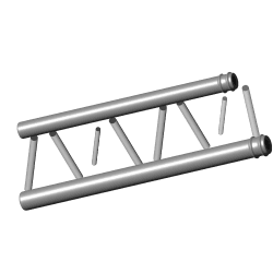
Truss Analysis and Design
2D truss input
No sub pages
Code source
No sub pages
Loading
Timber Strut Designer to AS1720.1
CT - Timber Column Design to AS17201
No sub pages
🇪🇺
Europe
Loading
Seismic Spectrum Calculator to EC8
Eurocode_8
No sub pages
Loading
Steel Section Designer to EC3
Eurocode_Section_Analysis_SingleForces_00
No sub pages
Loading
Timber Beam Calculator to EC5
Design+Template+-+Timber+-+Rafters+and+joists+A1
No sub pages
Loading
Elastic Critical Moment Calculator for Lateral Torsional Buckling to EC3
Eurocode_Section_Analysis_Combined_00
No sub pages
Loading
Steel Base Plate Designer to EC3
Loading
Concrete One-Way Slab Designer to EC2
Code source
No sub pages
Loading
Concrete Corbel Designer to EC2
Design of Corbel based on Eurocode_etc_rev1
No sub pages
🇺🇸
US
Loading
Steel Beam and Column Designer to AISC 360
CT - Steel Beam and Column Design to AISC
No sub pages
🌬️
Wind Loading Calculator to ASCE 7-10
🌬️
Wind Load (Low-Rise)
ASCE710W_v2_4
No sub pages
🌬️
Wind Load (Open Building)
ASCE710W_v2_4
No sub pages
🌬️
Wind Load (Roof Components & Cladding)
ASCE710W_v2_4
No sub pages
🌬️
Wind Load (Wall Components & Cladding)
ASCE710W_v2_4
No sub pages
🌬️
Wind Load (Any Height)
ASCE710W_v2_4
No sub pages
ASCE710W_v2_4
No sub pages
Loading
Steel Baseplate Designer to AISC 360
baseplate
No sub pages
Loading
Concrete Slab-on-grade Calculator to ACI 360R-10
CONCRETE SLAB ON GRADE - CT
No sub pages
Loading
Concrete Rectangular Beam Calculator to ACI 318-19 (IMP)
RC Rectangular Beams
No sub pages
Loading
Concrete Rectangular Spread Footing Designer to ACI
Loading
Purlin and Girts Size Calculator to AISI
Purlin and Girt Calc (3)
No sub pages
Loading
Purlin and Girts Size Calculator to AISI 2
Purlin and Girt Calc (3)
No sub pages
Loading
Concrete One-way Slab Designer to ACI318
CT - RC Slab Design to ACI318
No sub pages
Loading
Mass Timber Self-weight Calculator
Code source
No sub pages
Loading
Concrete Column P-M Diagram Calculator to ACI
Loading
CLT Properties Calculator to ANSI/APA PRG 320
CLT Properties Data
No sub pages
Loading
Wood Density Calculator
wood information
No sub pages
Loading
Wood Moisture Content Calculator
wood moisture calc
No sub pages
Loading
Wood Specific Gravity Calculator
wood information
No sub pages
Loading
Wood Shrinkage Calculator
wood information
No sub pages
🌐
Other

Loading
Beam Analysis using Anastruct
Code source
No sub pages
Loading
Concrete Column P-M Diagram Calculator
Loading
Beam Analysis using Macaulay's Theorem
Loading
Beam Analysis Calculator for simply supported beam with point moment
Code source
No sub pages
Loading
Beam Analysis Calculator for cantilever beam with point moment
Code source
No sub pages
Loading
Beam Analysis Calculator for simply supported beam with trapezoidal load
Code source
No sub pages
Loading
Beam Analysis Calculator for simply supported beam with triangular load
Code source
No sub pages
Loading
Beam Analysis Calculator for cantilever beam with triangular load
Code source
No sub pages
Loading
Beam Analysis Calculator for cantilever beam with point load
Code source
No sub pages
Loading
Beam Analysis Calculator for simply supported beam with UDL
Code source
No sub pages
Loading
Beam Analysis Calculator for cantilever beam with UDL
Code source
No sub pages
Loading
Beam Analysis Calculator for cantilever beam with trapezoidal load
Code source
No sub pages
Loading
Beam Analysis Calculator for beam with multiple loads
Code source
No sub pages
Loading
Beam Analysis Calculator for simply supported beam with point load
Code source (1)
No sub pages
Loading
2D Truss Analysis using OpenSeesPy
Loading

Sample Project
Code source
No sub pages
Loading
Beam Analysis Calculator - Beam VC
Code source
No sub pages
Loading
Concrete Column Designer to AS3600
CT - RC Column Design to AS3600
No sub pages
Loading
Concrete Beam Designer to AS3600 - Beam VC
Loading
Concrete Rectangular Footing Designer to AS3600
Concrete Footing Design to AS3600-2018
No sub pages
Loading
Mechanical Engineering
Loading
Air Duct Velocity Calculator
No sub pages
🚤
Buoyancy Force Calculator
No sub pages
Loading
Heat Transfer Calculator
No sub pages
Loading
Static Pressure Calculator
No sub pages
Loading
Dynamic Pressure Calculator
No sub pages
Loading

Room Ventilation Calculator: Area Method
No sub pages
🛩️
Mach Number Calculator
No sub pages
Loading
Volumetric Efficiency Calculator
Volumetric Efficiency of an ICE
No sub pages
Loading
Duct Pressure Drop Calculator
No sub pages
Loading
Room ventilation calculator: Occupancy Method
No sub pages
Loading
Log Mean Temperature Difference (lmtd) Calculator
No sub pages
Loading
Log Mean Temperature Difference in Counter Flow Heat Exchangers
No sub pages
📚
Articles & Resources
⚒️
Engineering
🧭
General
Loading
Engineering Calculation Template – Detailed Guide
No sub pages
🤷
No more engineers? Understanding Australia’s engineering skills shortage
No sub pages
📐
Quality control in engineering calculations using Units
No sub pages
Loading
Engineering Design Guide Articles
📓
Design Guide: Trusses
Loading
Common Truss Types
No sub pages
Loading
Truss Analysis
No sub pages
Loading
Steps for Designing Truss Members to Australian Standards
No sub pages
📓
Design Guide: Shear Wall to Australian Standards
No sub pages
📓
Design Guide: Shear Wall to ACI Standards
No sub pages
📓
Design Guide: Pad Footings
No sub pages
📓
Design Guide: Purlins and Girts for Structural Support in Buildings
No sub pages
📓
Design Guide: Structural Load Calculations
No sub pages
📓
Design Guide: RC Staircase
No sub pages
📓
Design Guide: Limit State Design of steel members to AS4100
No sub pages
📓
Design Guide: Steel Bracing Systems
Loading
Steps for Designing Steel Bracing - General Guide
No sub pages
Loading
Steel Bracing Design For Limit State
No sub pages
Loading
Steps for Designing Steel Bracing to Australian Standards
No sub pages
📓
Design Guide: Concrete Footing to AS3600
No sub pages
📓
Design Guide: Timber Members
🏢
Structural Engineering Articles
👍
Steel Design Rules of Thumb for Structural Engineers
No sub pages
Loading
Cement 101: What you need to know about this major construction material and it’s alternatives
New Microsoft Excel Worksheet
No sub pages
Loading
High strength structural steel and Its Properties
No sub pages
❓
Essential Knowledge for Structural Engineers: Skills and Expertise
No sub pages
🏟️
Australia's Top Stadiums: Engineer's Perspective
No sub pages
Loading
OpenSeesPy vs ETABS: 2D Frame Modal Analysis Comparison
Loading
Get started with OpenSees on CalcTree
Code source
No sub pages
Loading
Mechanical Engineering Articles
Loading
Electrical Engineering Articles
🌱
Sustainability
Loading
Engineering Designs & Codes
🧵
Sustainable Materials in Civil Engineering
🧱
Hempcrete: Building Smart, Green, and for the Future
No sub pages
Loading
Sustainability and mass timber construction: top of mind and leading edge
No sub pages
Loading
Top 5 Innovative & Sustainable Materials that should be mainstream in the construction industry
No sub pages
Loading
Low Heat Cement 101 And Its Alternatives
No sub pages
🎈
Embodied Carbon
Loading
Physics
🔥
Thermodynamics
🔥
Intro to Thermodynamics
No sub pages
🔄
Brayton Cycles
Loading
Brayton Cycle Calculator
No sub pages
Loading
Brayton Cycle With Regeneration Calculator
No sub pages
Loading
Brayton Cycle With Reheater Calculator
No sub pages
🔄
Dual Combustion Cycle
Loading
Duel Combustion Cycle Calculator
No sub pages
🔄
Diesel Cycle
Loading
Diesel Cycle Calculator
No sub pages
🔄
Power Cycles: The Carnot and Otto Cycle
🔥
Heat Engine
Loading
Heat Engine Calculator
No sub pages
🧊
Refrigerator
Loading
Refrigerator Calculator
No sub pages
🔥
Heat Pumps
Loading
Heat Pump Calculator
No sub pages
Loading

Types of Pulleys & Calculators
No sub pages
Loading

Logic Gates explained with calculators
No sub pages
🧮
Matrix Algebra and its applications in Engineering and Physics
Matrix Algebra Operations
No sub pages
🎓
Fundamentals
🎓
Beam Analysis and Design Fundamentals
No sub pages
🎓
Fundamentals: Newton’s 3 Laws of Motion
No sub pages
🎓
Fundamentals: Second Moment of Inertia
No sub pages
💡
Energy–momentum relation
Loading
Energy–momentum Relation Calculator
No sub pages
Loading
Applications of Fourier Series in Signal Processing and Engineering
Fourier
No sub pages
🏗️
Construction
🚇
Megaproject Spotlight: Constructing the World’s Longest Railway Tunnel
No sub pages
🕌
Modernism & Mishaps in Mega Project Management
No sub pages
🌉
Lessons from the Tacoma Bridge Collapse: Avoiding Historic Construction Failures
No sub pages
🗼
Lessons from Historic Construction Failures: Tower of Pisa and Beyond
No sub pages
Loading
Mathematics
Loading
Partial derivatives
No sub pages
Loading
Probability and Statistics, including Distributions and Hypothesis Testing
No sub pages
Loading
17 Of The Most Important Equations You'll Ever Learn
No sub pages
🏹
Vector Calculus and its Applications in Science
No sub pages
Loading
Integral and Trigonometric Relationships
No sub pages
💻
Technology
🧠
The Rise of Generative AI And Its Challenges
No sub pages
Loading
ChatGPT Challenges in Engineering Data Calculation
No sub pages
Loading
Construction industry challenges: Common Data Environments
No sub pages
Loading
Importance of data integration for the construction industry
No sub pages
☁️
Why Cloud-Based Software is the Future of the Construction Industry
No sub pages
💻
Civil Engineering Software To Transform Your Calculations
No sub pages
🖥️
Transform Your Python Script into a Web App with CalcTree: A Step-by-Step Guide
🔗
Streamlining Your Workflow: How to Connect Spreadsheets and Python Scripts with CalcTree
Loading
Embedding Spreadsheet Values in Reports with CalcTree
Structural Embodied Carbon Calculation
No sub pages
🖥️
Transform Your Engineering Spreadsheets into Web Apps with CalcTree: A Step-by-Step Guide
CT - RC Column Design to AS3600
No sub pages
🧠
Enhancing Civil Engineering Calculations in Chatbots with CalcTree API Integration
Code source
No sub pages
📖
Guides & Support
🏁
Getting started
🔢
Native formulas
No sub pages
Loading
Spreadsheets
a_basic_spreadsheet
No sub pages
🐍
Python
Code source
No sub pages
🔗
Linking parameters
No sub pages
✍️
Add Content
📍
Headings, Toggles, Lists and Columns
No sub pages
Loading
Columns
No sub pages
🖼️
Images
No sub pages
🧮
LaTex equations
No sub pages
📄
Pages
No sub pages
Loading
Page Layout
No sub pages
Loading
Math formula
🔌
Spreadsheets
👟
Quick start
No sub pages
☁️
Upload Spreadsheet
No sub pages
🔗
Map Parameters
No sub pages
🔢
Tables
No sub pages
📈
Charts
No sub pages
🖊️
Edit Spreadsheet
No sub pages
🔢
Spreadsheet errors
No sub pages
🔍
Source Viewer
No sub pages
🐍
Python
👟
Quick start Python
Code source
No sub pages
Loading
Run Python Scripts
No sub pages
🔗
Use Parameters with Python
No sub pages
⚖️
Units in Python
Code source
No sub pages
🔢
Python Tables
Code source
No sub pages
📚
Python Libraries List
No sub pages
📉
Create charts with Python
🦗
Grasshopper
No sub pages
☁️
API
No sub pages
🖨️
Print report
📣
Share Pages
No sub pages
Loading
Leverage Templates
👷
Manage Workspace
🌵
Contact CalcTree
🛎️
Changelog
No sub pages
🐞
Report Bug
No sub pages
💬
Give Feedback
No sub pages
💡
Request Feature
No sub pages
🗣️
Community Chat (Slack)
No sub pages
🏢
Enterprise Sales
No sub pages
🌵
CalcTree
💡
Opinions
📈
Why contech needs more product-led growth companies
No sub pages
🔨
Contech is the new fintech: Why it’s time to get in!
No sub pages
⛰️
Mission
🗺️
CalcTree’s mission - Bringing engineering, designs and calculations together
No sub pages
🌏
Embracing a Sustainable Existence on Planet Earth And Beyond
No sub pages
📣
Check out our CEO's 'Startup Daily' interview!
No sub pages
💗
Culture
🎓
Interning at CalcTree
No sub pages
🪟
A window into CalcTree’s values and culture
No sub pages
⚖️
Work-Life Balance is a top priority at CalcTree - Check out our Co-Founder Tim Rawling’s ‘Balance the Grind’ Interview for his thoughts on it
No sub pages
👋
Meet the founders behind CalcTree
No sub pages
👀
Job openings
🏛️
Investors
Loading
CalcTree joins Suffolk Technologies Boost Program
No sub pages
🏦
Meet the investors behind CalcTree
No sub pages
🦌
Check us out in the Antler network!
No sub pages
🎉
We've secured Antler backing!
No sub pages
⚖️
Legal
No sub pages
📉
CalcTree benefits: reduce risk
No sub pages
⏩
CalcTree benefits: increase efficiencies
No sub pages
🗺️
CalcTree benefits: improve collaboration
No sub pages
💡
CalcTree benefits: accelerate innovation
No sub pages
Loading
Tensile Strength and Capacity Control of the W-Shape Sections According to AISC 360-16
AISC
No sub pages
Loading
Concrete Cylinder Strength Vs Cube Strength
No sub pages
Loading
Earthquake Design Action Calculation
EM Wave Propagation Calculator
Code source
No sub pages
İKSA YAPILARI PROJELENDİRME HİZMET BEDELİ (2024)
iksa teklif fiyat hesabı-2023
No sub pages
section properties with units
GEOTEKNİK RAPOR (EK-B) ASGARİ HİZMET BEDELİ (2024)
Geoteknik Rapor (ZTE) Teklif-2023
No sub pages
Forward Kinematics of Robotic Arm with 6 Degrees of Freedom
DH_P
No sub pages
ZEMİN İYİLEŞTİRME/DERİN TEMEL PROJELENDİRME ASGARİ HİZMET BEDELİ (2024)
Zemin İyileştirme-Derin Temel Teklif-2023
No sub pages
İKSA YAPILARI PROJELENDİRME HİZMET BEDELİ (2023)
iksa teklif fiyat hesabı-2023
No sub pages
Loading
Dezi et. al (2010)
Kinematik_Analitik_BoredPile
No sub pages
🤾
Projectile motion
Code source
No sub pages
You can add Python-generated charts to your page using Matplotlib, a Python library.
Each time the Python source is executed, the chart updates. Try changing the parameters below to see it in action:
Line width
:3.00
Frequency
:2.00
Can’t display the image because of an internal error. Our team is looking at the issue.
How to add a Python-generated chart
Please follow these three steps:
Step one: Add a Python source
First, you should add a Python source to your page. Click on Python on the Integrations sidebar:
Select Python from the Integrations sidebar
If you cannot see the Integrations sidebar, click on the plug icon, then on + Add :
Click on + Add icon to see the Python option
When you click on Python, an example Python source code will be added:
A Python source is added to the page
Step two: Add Matplotlib code
If a Python source code includes a chart created using Matplotlib, it will be extracted and displayed on the integrations sidebar.
The default sample Python code doesn't have Matplotlib charts, so you will need to add one. To do so, you can choose a sample Matplotlib chart from the examples available on the official Matplotlib website, for example:
pick a sample Matplotlib chart from the official website
Replace the Python code in the source editor with the sample you just picked up. After a few moments, the chart will be extracted from the code and shown on the Integrations sidebar:
Matplotlib chart appears on the Integrations sidebar
Step three: Drop the chart on the page
To add the chart to your page, simply drag and drop it to the desired location. See it in action below:
Drag and drop the chart on the page
How to add parameters to the chart
The sample Matplotlib code will create a chart with pre-set values and configurations. If you modify the sample code to use parameters, the chart updates every time those parameters change.
For example, in the chart shown at the top of this page, which is taken from here, we used two parameters in the code - see how it was created below:
Connecting Python chart to page parameters
Recommended styles for Python-generated charts
Matplotlib offers extensive customisation options for lines, axes, colors, fonts, and more. To create Python-generated charts consistent with other CalcTree branding, you can use the following style settings:
Python Charts Style Guide
Still have more questions?
Join the conversation on Slack below!